# Confusion Matrix
<head>
<link rel="stylesheet" type="text/css" href="../css/style.css">
</head>
## Overview
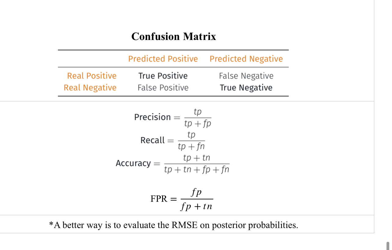
A _confusion matrix_ is a table that is often used to describe the performance of a classification model (or classifier) on a set of test data for which the true values are known.
![Confusion Matrix|600xauto {Figure 1: Confusion Sample [1].}](https://user-images.githubusercontent.com/2695661/151418583-57ef8547-c9f9-4f42-9424-24d134ba60b2.jpeg)
## Terminology
True positives = relevant items that we correctly identified as relevant.
True negatives = irrelevant items that we correctly identified as irrelevant.
False positive (Type I errors) = irrelevant items that were incorrectly identified as relevant.
False negatives (Type II errors) = relevant items that were incorrectly identified as irrelevant.
----------
Precision = percentage of true positive predictions among all positive predictions
Recall or true positive rate (TPR) = percentage of true positive predictions among all true positives
The F-Measure (F-Score) combines the precision and recall to give a single score and is defined to be the harmonic mean of the precision and recall: (2 × Precision × Recall) / (Precision + Recall).
Can have high accuracy but not high precision.
If your data was almost all positive, you could always predict value as positive and get high accuracy but not good precision.
The false-negative and false-positive in the confusion matrix are examples of _base rate fallacy_ which is the likelihood of judging a specific situation while not taking into consideration all relevant data [3].
## ROC Curve
ROC curve is a commonly used way to visualize the performance of a binary classifier.
ROC Curve is a commonly used graph that summarizes the performance of a classifier over all possible thresholds.
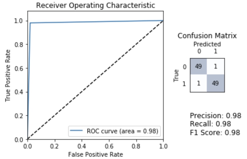
ROC Curve is generated by plotting the True Positive Rate (y-axis) versus the False Positive Rate (x-axis) as you vary the threshold for assigning observations to a given class where threshold ranges from 0 to 1.
We can use the ROC curve to quantify the performance of a classifier which is the purpose of Area Under the Curve (AUC) which is the percentage of the box that is under the curve.
A very poor classifier has an AUC of around 0.5.
The ROC curve and AUC are insensitive to whether the predicted probabilities are properly calibrated to actually represent probabilities of class membership.
All the AUC metric cares about is how well your classifier separated the two classes so it is said to only be sensitive to rank ordering.
You can think of AUC as representing the probability that a classifier will rank a randomly chosen positive observation higher than a randomly chosen negative observation, so it is a useful metric even for datasets with highly unbalanced classes.
## References
[1]: [Simple guide to confusion matrix terminology](https://www.dataschool.io/simple-guide-to-confusion-matrix-terminology/)
[2]: [ROC curves and Area Under the Curve explained](https://www.dataschool.io/roc-curves-and-auc-explained/)
[3]: [The Base Rate Fallacy and its Impact on Data Science](https://www.kdnuggets.com/2023/04/base-rate-fallacy-impact-data-science.html)